创建一个正在输入指示器
现代聊天应用会在其他用户正在积极输入回复时显示指示器。这些指示器有助于防止你和对方之间出现快速且冲突的回复。在本食谱中,你将构建一个可以动画显示和隐藏的语音气泡输入指示器。
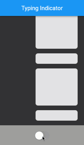
下面的动画演示了应用程序的行为:
定义正在输入指示器小部件
#正在输入指示器存在于它自己的小部件中,以便它可以用于应用程序中的任何位置。与任何控制动画的小部件一样,正在输入指示器需要是一个有状态的小部件。该小部件接受一个布尔值,该值决定指示器是否可见。这个语音气泡输入指示器接受气泡的颜色以及大语音气泡内闪烁圆圈的明暗两个阶段的颜色。
定义一个名为 TypingIndicator 的新的有状态小部件。
class TypingIndicator extends StatefulWidget {
  const TypingIndicator({
    super.key,
    this.showIndicator = false,
    this.bubbleColor = const Color(0xFF646b7f),
    this.flashingCircleDarkColor = const Color(0xFF333333),
    this.flashingCircleBrightColor = const Color(0xFFaec1dd),
  });

  final bool showIndicator;
  final Color bubbleColor;
  final Color flashingCircleDarkColor;
  final Color flashingCircleBrightColor;

  @override
  State<TypingIndicator> createState() => _TypingIndicatorState();
}

class _TypingIndicatorState extends State<TypingIndicator> {
  @override
  Widget build(BuildContext context) {
    // TODO:
    return const SizedBox();
  }
}
为正在输入指示器腾出空间
#当正在输入指示器未显示时,它不占用任何空间。因此,指示器需要在出现时高度增加,在消失时高度减小。
正在输入指示器的高度可以是正在输入指示器内语音气泡的自然高度。但是,语音气泡会随着弹性曲线而膨胀。如果这种弹性快速地向上或向下推动所有对话消息,则视觉上会过于突兀。相反,正在输入指示器的动画高度自行变化,在气泡出现之前平滑地扩展。当气泡消失时,高度平滑地收缩到零。此行为需要对正在输入指示器的高度进行显式动画。
为正在输入指示器的高度定义一个动画,然后将该动画值应用于正在输入指示器内的 SizedBox 小部件。
class _TypingIndicatorState extends State<TypingIndicator>
    with TickerProviderStateMixin {
  late AnimationController _appearanceController;
  late Animation<double> _indicatorSpaceAnimation;

  @override
  void initState() {
    super.initState();

    _appearanceController = AnimationController(
      vsync: this,
    );

    _indicatorSpaceAnimation = CurvedAnimation(
      parent: _appearanceController,
      curve: const Interval(0.0, 0.4, curve: Curves.easeOut),
      reverseCurve: const Interval(0.0, 1.0, curve: Curves.easeOut),
    ).drive(Tween<double>(
      begin: 0.0,
      end: 60.0,
    ));

    if (widget.showIndicator) {
      _showIndicator();
    }
  }

  @override
  void didUpdateWidget(TypingIndicator oldWidget) {
    super.didUpdateWidget(oldWidget);

    if (widget.showIndicator != oldWidget.showIndicator) {
      if (widget.showIndicator) {
        _showIndicator();
      } else {
        _hideIndicator();
      }
    }
  }

  @override
  void dispose() {
    _appearanceController.dispose();
    super.dispose();
  }

  void _showIndicator() {
    _appearanceController
      ..duration = const Duration(milliseconds: 750)
      ..forward();
  }

  void _hideIndicator() {
    _appearanceController
      ..duration = const Duration(milliseconds: 150)
      ..reverse();
  }

  @override
  Widget build(BuildContext context) {
    return AnimatedBuilder(
      animation: _indicatorSpaceAnimation,
      builder: (context, child) {
        return SizedBox(
          height: _indicatorSpaceAnimation.value,
        );
      },
    );
  }
}
TypingIndicator 根据传入的 showIndicator 变量是 true 还是 false 分别向前或向后运行动画。
控制高度的动画根据其方向使用不同的动画曲线。当动画向前移动时,它需要快速为语音气泡腾出空间。为此,向前曲线在整个外观动画的前 40% 内运行整个高度动画。当动画反转时,它需要给语音气泡足够的时间消失,然后再收缩高度。使用所有可用时间的缓出曲线是实现此行为的好方法。
动画语音气泡
#正在输入指示器显示三个语音气泡。前两个气泡小而圆。第三个气泡是椭圆形的,包含几个闪烁的圆圈。这些气泡从可用空间的左下方交错排列。
每个气泡都通过将其比例从 0% 动画到 100% 来出现,并且每个气泡在略微不同的时间这样做,以便看起来每个气泡都出现在前一个气泡之后。这被称为交错动画。
从左下方绘制三个气泡到所需位置。然后,对气泡的比例进行动画处理,以便每当 showIndicator 属性更改时,气泡都会交错出现。
class _TypingIndicatorState extends State<TypingIndicator>
    with TickerProviderStateMixin {
  late AnimationController _appearanceController;

  late Animation<double> _indicatorSpaceAnimation;

  late Animation<double> _smallBubbleAnimation;
  late Animation<double> _mediumBubbleAnimation;
  late Animation<double> _largeBubbleAnimation;

  late AnimationController _repeatingController;
  final List<Interval> _dotIntervals = const [
    Interval(0.25, 0.8),
    Interval(0.35, 0.9),
    Interval(0.45, 1.0),
  ];

  @override
  void initState() {
    super.initState();

    _appearanceController = AnimationController(
      vsync: this,
    )..addListener(() {
        setState(() {});
      });

    _indicatorSpaceAnimation = CurvedAnimation(
      parent: _appearanceController,
      curve: const Interval(0.0, 0.4, curve: Curves.easeOut),
      reverseCurve: const Interval(0.0, 1.0, curve: Curves.easeOut),
    ).drive(Tween<double>(
      begin: 0.0,
      end: 60.0,
    ));

    _smallBubbleAnimation = CurvedAnimation(
      parent: _appearanceController,
      curve: const Interval(0.0, 0.5, curve: Curves.elasticOut),
      reverseCurve: const Interval(0.0, 0.3, curve: Curves.easeOut),
    );
    _mediumBubbleAnimation = CurvedAnimation(
      parent: _appearanceController,
      curve: const Interval(0.2, 0.7, curve: Curves.elasticOut),
      reverseCurve: const Interval(0.2, 0.6, curve: Curves.easeOut),
    );
    _largeBubbleAnimation = CurvedAnimation(
      parent: _appearanceController,
      curve: const Interval(0.3, 1.0, curve: Curves.elasticOut),
      reverseCurve: const Interval(0.5, 1.0, curve: Curves.easeOut),
    );

    if (widget.showIndicator) {
      _showIndicator();
    }
  }

  @override
  void didUpdateWidget(TypingIndicator oldWidget) {
    super.didUpdateWidget(oldWidget);

    if (widget.showIndicator != oldWidget.showIndicator) {
      if (widget.showIndicator) {
        _showIndicator();
      } else {
        _hideIndicator();
      }
    }
  }

  @override
  void dispose() {
    _appearanceController.dispose();
    super.dispose();
  }

  void _showIndicator() {
    _appearanceController
      ..duration = const Duration(milliseconds: 750)
      ..forward();
  }

  void _hideIndicator() {
    _appearanceController
      ..duration = const Duration(milliseconds: 150)
      ..reverse();
  }

  @override
  Widget build(BuildContext context) {
    return AnimatedBuilder(
      animation: _indicatorSpaceAnimation,
      builder: (context, child) {
        return SizedBox(
          height: _indicatorSpaceAnimation.value,
          child: child,
        );
      },
      child: Stack(
        children: [
          AnimatedBubble(
            animation: _smallBubbleAnimation,
            left: 8,
            bottom: 8,
            bubble: CircleBubble(
              size: 8,
              bubbleColor: widget.bubbleColor,
            ),
          ),
          AnimatedBubble(
            animation: _mediumBubbleAnimation,
            left: 10,
            bottom: 10,
            bubble: CircleBubble(
              size: 16,
              bubbleColor: widget.bubbleColor,
            ),
          ),
          AnimatedBubble(
            animation: _largeBubbleAnimation,
            left: 12,
            bottom: 12,
            bubble: StatusBubble(
              dotIntervals: _dotIntervals,
              flashingCircleDarkColor: widget.flashingCircleDarkColor,
              flashingCircleBrightColor: widget.flashingCircleBrightColor,
              bubbleColor: widget.bubbleColor,
            ),
          ),
        ],
      ),
    );
  }
}

class CircleBubble extends StatelessWidget {
  const CircleBubble({
    super.key,
    required this.size,
    required this.bubbleColor,
  });

  final double size;
  final Color bubbleColor;

  @override
  Widget build(BuildContext context) {
    return Container(
      width: size,
      height: size,
      decoration: BoxDecoration(
        shape: BoxShape.circle,
        color: bubbleColor,
      ),
    );
  }
}

class AnimatedBubble extends StatelessWidget {
  const AnimatedBubble({
    super.key,
    required this.animation,
    required this.left,
    required this.bottom,
    required this.bubble,
  });

  final Animation<double> animation;
  final double left;
  final double bottom;
  final Widget bubble;

  @override
  Widget build(BuildContext context) {
    return Positioned(
      left: left,
      bottom: bottom,
      child: AnimatedBuilder(
        animation: animation,
        builder: (context, child) {
          return Transform.scale(
            scale: animation.value,
            alignment: Alignment.bottomLeft,
            child: child,
          );
        },
        child: bubble,
      ),
    );
  }
}

class StatusBubble extends StatelessWidget {
  const StatusBubble({
    super.key,
    required this.dotIntervals,
    required this.flashingCircleBrightColor,
    required this.flashingCircleDarkColor,
    required this.bubbleColor,
  });

  final List<Interval> dotIntervals;
  final Color flashingCircleDarkColor;
  final Color flashingCircleBrightColor;
  final Color bubbleColor;

  @override
  Widget build(BuildContext context) {
    return Container(
      width: 85,
      height: 44,
      padding: const EdgeInsets.symmetric(horizontal: 8),
      decoration: BoxDecoration(
        borderRadius: BorderRadius.circular(27),
        color: bubbleColor,
      ),
    );
  }
}
动画闪烁的圆圈
#在大语音气泡内,正在输入指示器显示三个反复闪烁的小圆圈。每个圆圈的闪烁时间略有不同,给人一种单个光源在每个圆圈后面移动的印象。此闪烁动画无限重复。
引入一个重复的 AnimationController 来实现圆圈闪烁,并将其传递给 StatusBubble。
class _TypingIndicatorState extends State<TypingIndicator>
    with TickerProviderStateMixin {
  late AnimationController _appearanceController;

  late Animation<double> _indicatorSpaceAnimation;

  late Animation<double> _smallBubbleAnimation;
  late Animation<double> _mediumBubbleAnimation;
  late Animation<double> _largeBubbleAnimation;

  late AnimationController _repeatingController;
  final List<Interval> _dotIntervals = const [
    Interval(0.25, 0.8),
    Interval(0.35, 0.9),
    Interval(0.45, 1.0),
  ];

  @override
  void initState() {
    super.initState();

    // other initializations...

    _repeatingController = AnimationController(
      vsync: this,
      duration: const Duration(milliseconds: 1500),
    );

    if (widget.showIndicator) {
      _showIndicator();
    }
  }

  @override
  void dispose() {
    _appearanceController.dispose();
    _repeatingController.dispose();
    super.dispose();
  }

  void _showIndicator() {
    _appearanceController
      ..duration = const Duration(milliseconds: 750)
      ..forward();
    _repeatingController.repeat(); // <-- 添加此行
  }

  void _hideIndicator() {
    _appearanceController
      ..duration = const Duration(milliseconds: 150)
      ..reverse();
    _repeatingController.stop(); // <-- 添加此行
  }

  @override
  Widget build(BuildContext context) {
    return AnimatedBuilder(
      animation: _indicatorSpaceAnimation,
      builder: (context, child) {
        return SizedBox(
          height: _indicatorSpaceAnimation.value,
          child: child,
        );
      },
      child: Stack(
        children: [
          AnimatedBubble(
            animation: _smallBubbleAnimation,
            left: 8,
            bottom: 8,
            bubble: CircleBubble(
              size: 8,
              bubbleColor: widget.bubbleColor,
            ),
          ),
          AnimatedBubble(
            animation: _mediumBubbleAnimation,
            left: 10,
            bottom: 10,
            bubble: CircleBubble(
              size: 16,
              bubbleColor: widget.bubbleColor,
            ),
          ),
          AnimatedBubble(
            animation: _largeBubbleAnimation,
            left: 12,
            bottom: 12,
            bubble: StatusBubble(
              repeatingController: _repeatingController, // <-- 添加此行
              dotIntervals: _dotIntervals,
              flashingCircleDarkColor: widget.flashingCircleDarkColor,
              flashingCircleBrightColor: widget.flashingCircleBrightColor,
              bubbleColor: widget.bubbleColor,
            ),
          ),
        ],
      ),
    );
  }
}

class StatusBubble extends StatelessWidget {
  const StatusBubble({
    super.key,
    required this.repeatingController,
    required this.dotIntervals,
    required this.flashingCircleBrightColor,
    required this.flashingCircleDarkColor,
    required this.bubbleColor,
  });

  final AnimationController repeatingController;
  final List<Interval> dotIntervals;
  final Color flashingCircleDarkColor;
  final Color flashingCircleBrightColor;
  final Color bubbleColor;

  @override
  Widget build(BuildContext context) {
    return Container(
      width: 85,
      height: 44,
      padding: const EdgeInsets.symmetric(horizontal: 8),
      decoration: BoxDecoration(
        borderRadius: BorderRadius.circular(27),
        color: bubbleColor,
      ),
      child: Row(
        mainAxisAlignment: MainAxisAlignment.spaceEvenly,
        children: [
          FlashingCircle(
            index: 0,
            repeatingController: repeatingController,
            dotIntervals: dotIntervals,
            flashingCircleDarkColor: flashingCircleDarkColor,
            flashingCircleBrightColor: flashingCircleBrightColor,
          ),
          FlashingCircle(
            index: 1,
            repeatingController: repeatingController,
            dotIntervals: dotIntervals,
            flashingCircleDarkColor: flashingCircleDarkColor,
            flashingCircleBrightColor: flashingCircleBrightColor,
          ),
          FlashingCircle(
            index: 2,
            repeatingController: repeatingController,
            dotIntervals: dotIntervals,
            flashingCircleDarkColor: flashingCircleDarkColor,
            flashingCircleBrightColor: flashingCircleBrightColor,
          ),
        ],
      ),
    );
  }
}

class FlashingCircle extends StatelessWidget {
  const FlashingCircle({
    super.key,
    required this.index,
    required this.repeatingController,
    required this.dotIntervals,
    required this.flashingCircleBrightColor,
    required this.flashingCircleDarkColor,
  });

  final int index;
  final AnimationController repeatingController;
  final List<Interval> dotIntervals;
  final Color flashingCircleDarkColor;
  final Color flashingCircleBrightColor;

  @override
  Widget build(BuildContext context) {
    return AnimatedBuilder(
      animation: repeatingController,
      builder: (context, child) {
        final circleFlashPercent = dotIntervals[index].transform(
          repeatingController.value,
        );
        final circleColorPercent = sin(pi * circleFlashPercent);

        return Container(
          width: 12,
          height: 12,
          decoration: BoxDecoration(
            shape: BoxShape.circle,
            color: Color.lerp(
              flashingCircleDarkColor,
              flashingCircleBrightColor,
              circleColorPercent,
            ),
          ),
        );
      },
    );
  }
}
每个圆圈都使用正弦 (sin) 函数计算其颜色,以便颜色在最小值和最大值点逐渐变化。此外,每个圆圈都在一个指定的区间内对颜色进行动画处理,该区间占用整体动画时间的一部分。这些区间的排列位置产生了单个光源在三个点后面移动的视觉效果。
恭喜!您现在拥有一个正在输入指示器,可以让用户知道其他人何时正在输入。指示器会进行动画显示和隐藏,并在其他用户输入时显示重复动画。
交互式示例
#运行应用程序:
- 点击屏幕底部的圆形开关,打开和关闭正在输入指示器气泡。
import 'dart:math';

import 'package:flutter/cupertino.dart';
import 'package:flutter/material.dart';

void main() {
  runApp(
    const MaterialApp(
      home: ExampleIsTyping(),
      debugShowCheckedModeBanner: false,
    ),
  );
}

const _backgroundColor = Color(0xFF333333);

class ExampleIsTyping extends StatefulWidget {
  const ExampleIsTyping({
    super.key,
  });

  @override
  State<ExampleIsTyping> createState() => _ExampleIsTypingState();
}

class _ExampleIsTypingState extends State<ExampleIsTyping> {
  bool _isSomeoneTyping = false;

  @override
  Widget build(BuildContext context) {
    return Scaffold(
      backgroundColor: _backgroundColor,
      appBar: AppBar(
        title: const Text('Typing Indicator'),
      ),
      body: Column(
        children: [
          Expanded(
            child: ListView.builder(
              padding: const EdgeInsets.symmetric(vertical: 8),
              itemCount: 25,
              reverse: true,
              itemBuilder: (context, index) {
                return Padding(
                  padding: const EdgeInsets.only(left: 100),
                  child: FakeMessage(isBig: index.isOdd),
                );
              },
            ),
          ),
          Align(
            alignment: Alignment.bottomLeft,
            child: TypingIndicator(
              showIndicator: _isSomeoneTyping,
            ),
          ),
          Container(
            color: Colors.grey,
            padding: const EdgeInsets.all(16),
            child: Center(
              child: CupertinoSwitch(
                onChanged: (newValue) {
                  setState(() {
                    _isSomeoneTyping = newValue;
                  });
                },
                value: _isSomeoneTyping,
              ),
            ),
          ),
        ],
      ),
    );
  }
}

// ... (其余代码与上文相同) ...
除非另有说明,否则本网站上的文档反映的是 Flutter 的最新稳定版本。页面最后更新于 2025-01-30。 查看源代码 或 报告问题。